
Making Faster Systems
This essay is inspired by a 2023 in-person presentation I gave to an audience of software, mechanical, and electrical engineers. While its examples are software-related, the principles apply across domains.
In
Structured Programming with go to Statements, Donald E. Knuth wrote “…premature optimization is the root of all evil”, and people have been misquoting him ever since. They tend to miss both what he meant by “premature” and what has changed since he wrote those words in 1974.
But I’ll get back to that. First, let’s consider why we might want to make faster systems:
- It leads to happier customers — people generally don’t like waiting for things, and fast systems lead to fast feedback loops.
- It leads to happier companies — happier customers ideally lead to higher profits. In the case of client-server software, companies pay for the resources they use, and faster systems tend to use fewer resources. What company doesn’t want to decrease their cloud spend?
- It leads to a happier planet — reducing resource consumption reduces environmental impact.
- It leads to a happier you, because making systems faster is fun and rewarding.
For a concrete example of why making faster systems matters, consider my work at Lumafield: reducing the time to inspect products from hours to under a minute allowed the company to serve customers in entirely new market segments (see Empowering Manufacturers with X-ray Vision).
When Knuth scorned “premature optimization,” he was referring to the practice of making small micro-optimizations throughout a program until the code becomes impossible to understand or change. While micro-optimizations are sometimes justified, making faster systems encompasses a broad spectrum of activities.
There are three fundamental steps we need to take if we want to make faster systems:
- Understand the Problem
- Only Do Useful Work
- Measure
Unfortunately I think they’re too often neglected.
Understand the Problem
The purpose of human-designed systems is to solve problems. To build a fast system, we have to understand the problem we are solving, which includes understanding what we hope to achieve and the constraints under which we are operating.
At their simplest, we can think of systems as transforming inputs into outputs. Two systems with the same inputs and outputs can have vastly different performance characteristics.
We all know that nothing is faster than light. That is also true of software systems, which operate on physical computers, as much as marketing terms like “serverless” would have you think otherwise.
Every computer has one or more CPUs (central processing units) that process inputs into outputs. To make faster software systems, we have to understand how fast the computers that execute them are.
Computers are really fast. For example, adding two numbers together might take 0.33 nanoseconds. To put that in perspective:
- 1000 nanoseconds = 1 microsecond
- 1000 microseconds = 1 millisecond
- 1000 milliseconds = 1 second
Such a computer can perform 3,000,000,000 (3 billion) additions per lane per core per second.
If you open up a computer, take out the CPU, dunk it in a vat of hydrochloric acid, and look at it under a microscope, you’ll see something similar to this:
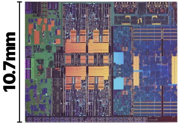
This chip (an 11th generation Intel CPU) has 4 cores:
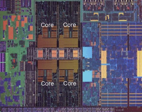
The parts of each core that perform addition are the execution units, and they’re connected to a series of memory caches:
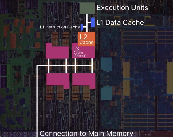
When adding numbers, if the execution units have already loaded the numbers to add, addition can be really fast. If they don’t, they have to fetch them from the small nearby piece of memory called the L1 data cache. If the L1 cache doesn’t have the numbers, they have to fetch them from the larger L2 cache. If the L2 cache doesn’t have the numbers, they have to fetch them from the L3 cache, which, on this chip, is shared across all 4 cores. If the L3 cache doesn’t have the data, they have to fetch them from main memory.
Each of these involves a longer and longer physical distance to a place with more storage, and the data has to physically travel to where it is needed. Physics is a hard constraint that can’t be ignored. Remember: nothing is faster than light.
Let’s put these distances into perspective with a race. When you click play in the following video, the blue boxes will move from left to right. If they moved at their regular speeds, you wouldn’t be able to tell their speeds apart, so I’ve slowed everything down 1 billion times: 1 second in the video corresponds to 1 nanosecond of real time. Can you guess how long main memory access will take? What about accessing an NVMe drive (which is faster than a hard drive or SSD)?
To keep the video short, I’ve summarized all the results in this table:
| Activity | Actual Time | Scaled |
|---|---|---|
| Add 2 numbers | 0.33 ns | 0.33 s |
| L1 Access | 1 ns | 1 s |
| L2 Access | 4 ns | 4 s |
| L3 Access | 16 ns | 16 s |
| Main Memory Access | 100 ns | 1.7 min |
| NVMe Drive Access | 700,000 ns | 8.1 days |
| BOS->SF Network Roundtrip | 80,000,000 ns | 2.5 years |
The specific times here don’t really matter and come from a computer I don’t have anymore. They’d be different on a different computer. What matters is that they span multiple orders of magnitude, and switching to a newer computer won’t change that. There’s quite a lot of difference between seconds and years.
In Structured Programming with go to Statements, Knuth wrote:
In established engineering disciplines a 12% improvement, easily obtained, is never considered marginal; and I believe the same viewpoint should prevail in software engineering.
What do you think he would say about a 10,000+% improvement (having the numbers in the L1 cache vs fetching them from memory)?
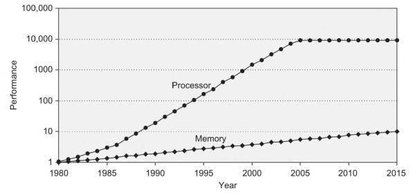
He was writing in 1974, when memory and processor speed were about the same. Since then, the gap between processor and memory speed has grown many orders of magnitude apart, and we can’t ignore that if we want to create fast software.
In 1974, Knuth’s programs executed almost directly on the CPU. A typical web application today has many more layers between its code and the CPU, including an operating system (30 million lines of code), a browser (26 million lines of code) with a virtual machine, and likely 10s-100s of 3rd party libraries running on end users’ computers. It likely also involves many more computers spread across datacenters throughout the world, each with their own layers of software. There are many more choices to make, and programmers need to understand the soft constraints imposed by those choices and the choices of the people who use their software. Even if the problem they are solving calls for a web application (not all problems call for a web application!), programmers and the people they work with can still decide the programming languages and 3rd party libraries they use, the code they write themselves, and on which computers the code runs. Every decision has consequences.
Only Do Useful Work
Once we’ve understood the problem, we can use our understanding to minimize waste. The fastest thing is doing nothing. The fastest useful thing is doing nothing unneeded.
To illustrate this, I’ll use a case study from a web project where I needed to find the brightest and darkest pixels in a user-specified region of an image. The inputs were the compressed image in main memory and the coordinates of the region. The desired outputs were the brightest and darkest pixel of the image.
When faced with a problem like this, I like to think about the simplest way of getting from the inputs to the outputs. This might not be the fastest way, but simple code with few dependencies is the easiest code to change.
In this case, the simplest approach I could think of was:
- Decompress the compressed image
- Sequentially look at every pixel in the user-specified region, recording the brightest and darkest pixels found so far
The code I inherited looked like this:
- Decompress the compressed image to main memory
- Upload the decompressed image to graphics memory
- Download the image from graphics memory
- Upload the image to graphics memory
- Create a copy of the pixels in the user-specified region
- Sort the copied pixels by brightness
- Retrieve the brightest and darkest pixels from the sorted copy
This code had passed code review. Its code style followed “industry best practices.” Unfortunately, those practices failed to produce code that minimized waste and was easy to understand and change. Improving these practices is a topic for a future article.
After my improvements, the code looked like this:
- Decompress the compressed image to main memory
- Upload the image to graphics memory
- Download the image from graphics memory
- Sequentially search the pixels in the user-specified region for the brightest and darkest pixels
This is not quite the simple strategy I wanted, but it was the best I could do given the problem constraints — it had to run in a web browser. The browser did not provide a way to directly access the image pixels after decompressing the image, so I needed to upload and download the image from graphics memory first. Nonetheless, my implementation was several times faster than the original.
Contrast this with a different (yet unfortunately common) strategy: if I had timed the original program, I might have found that the slowest individual part was sorting the pixels. I might have tried to replace the sorting algorithm with a faster, “optimized” algorithm for this application. That would have been a mistake, because sorting wasn’t necessary in the first place. Why waste time trying to make an unnecessary thing faster when you can remove it instead? Nothing is always faster than light.
Let’s return to Knuth’s “…premature optimization is the root of all evil.” Many people use this quote to justify ignoring performance altogether until it becomes a problem, with the aim of maximizing productivity. In my experience, such a strategy inevitably backfires, resulting instead in an ever-growing productivity drain interspersed with heroic rewrite efforts.
Measure
Measuring is crucial for making faster systems. It lets us understand how fast our systems are in practice, which lets us make comparisons:
- We can compare two systems to understand which is faster.
- If we can estimate the theoretical optimal speed of a system, we can compare that estimate to our real system’s speed to understand how much better it could be with additional effort.
With comparisons in hand, we can iterate. When we make changes,
- how much faster or slower is the new system than the old one?
- how close is our new system to the theoretical top speed?
When measuring “speed”, it’s important to differentiate latency (how long it takes to do something) from throughput (how many of those things you can do in a given timeframe). To understand the difference between latency and throughput, think of a laundromat. If a laundromat has 3 washing machines that each take 1 hour to wash a load of laundry, it will take no less than 1 hour to wash 1 load of laundry. The latency is 1 hour. Adding washing machines won’t make it go faster, but a faster washing machine would. However, with 3 machines, you can wash up to 3 loads of laundry at the same time. The throughput is 3 loads/hour.
For the rest of this section, I’ll use latency measurements from the “brain” of a reactive robotic display case I programmed in 2018. Among other things, the brain was responsible for deciding the colors of 1189 individual LEDs, 30 times per second (once every 33 milliseconds) using a slow $35 computer. In this problem, the throughput was fixed — the brain always needed to update all 1189 LEDs — and the maximum acceptable latency was 33 milliseconds. Unfortunately, determining the colors was the slowest part of the program and by itself took over 100 milliseconds on the $35 computer. I needed to make it much faster. How did I know to focus on this part of the program? I used profiling tools.
“It is often a mistake to make a priori judgments about what parts of a program are really critical, since the universal experience of programmers who have been using measurement tools has been that their intuitive guesses fail.”
– Knuth
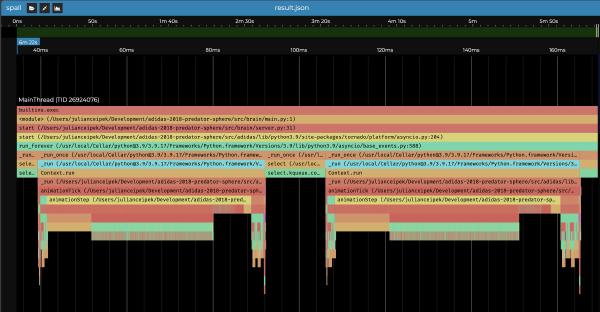
Profiling tools often produce icicle graphs — visualizations that show how long different parts of a process take using labeled rectangles arranged such that substeps are lower down than the steps that depend on them. In this icicle graph (produced using
viztracer and
Spall on my fast 2019 laptop), we can see that animationStep is a substep of animationTick, which is itself a substep of _run. The yellow rectangles labeled animationStep are wide, which suggests that the program is spending a lot of time in animationStep (around 50 milliseconds with profiler overhead).
When I first started practicing optimization, my approach was to measure the latency of an existing system, make some changes, measure again, and discard the changes if the newer measurement was slower. I notice many other people do this as well. This is a mistake.
If I measure three different implementations of animationTick once, I might get the following latencies:
- A (the implementation above, without profiler overhead): 20.9 milliseconds
- B: 0.58 milliseconds
- C: 1.97 milliseconds
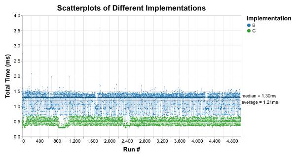
It seems like B is faster than C is much faster than A. But plotting thousands of runs for each implementation tells a different story:
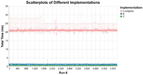
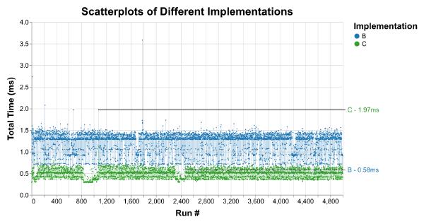
While A is consistently slower, there’s enough overlap between B and C that comparing single measurements of each could make it seem like B is faster than C, even though it usually isn’t.
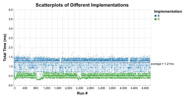
Trying to avoid this trap, many people turn to average measurements. Unfortunately, averages obscure the distribution of data. In fact, vastly different datasets can have the same average, variance, and correlation (see the Datasaurus Dozen). In most applications, latency outliers matter. You wouldn’t want a washing machine that takes an hour to wash your clothes on average but takes an entire day 10% of the time. After an update, my favorite podcast app sometimes took up to 3 seconds to respond when I tapped the play/pause button. I no longer use that app.
Here, the B average of 1.21 milliseconds completely hides the latency outlier at 3.59 milliseconds:
The median is not totally useless. While it still hides outliers, it tells us the latency that 50% of runs were faster (and slower) than:
But what we’re really interested in is more than we can capture in a single number (or even a few numbers). We want to understand the latency distribution. This is where we might be tempted to reach for histograms:
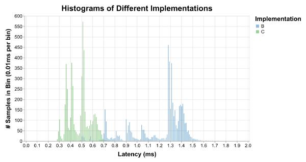
Unfortunately, histograms require picking a size for each bin, and bins don’t really make sense for continuous time measurements. Histograms are perfect if we want to be able to say things like “461 of the runs with implementation B took between 1.28 and 1.29 milliseconds.” I don’t know about you, but that’s not the kind of thing I’ve ever wanted to know.
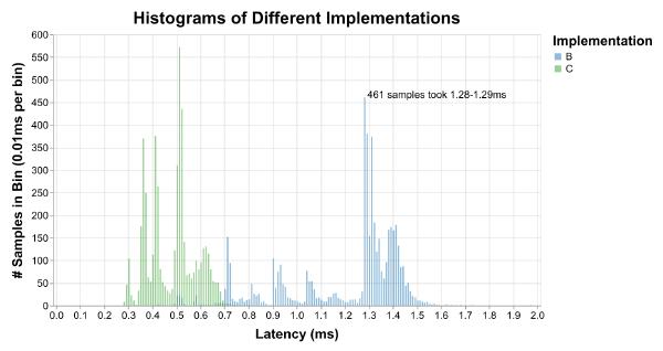
They also make it hard to answer the common questions we are interested in, like “what percent of the runs with implementation B were faster than 1.2 milliseconds?”
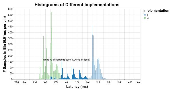
To answer that question, we would have to add up the heights of all the bars we’re interested in and divide by the total number of bars, which is really annoying to do by hand. Instead, we can use my favorite type of graph for latency distributions, Cumulative Distribution Functions. To produce a CDF, take an unbinned histogram and divide each bar height by the total number of bars to produce a Probability Density Function (PDF). Then plot the cumulative sum of the PDF. The result is a graph that shows all the same peaks and valleys that a histogram would:
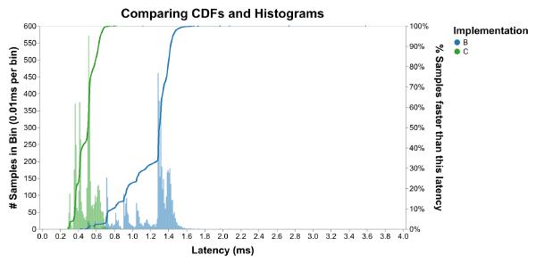
More importantly, the (X, Y) coordinate tells you that Y fraction of samples were faster than X time. For example, here’s the answer to our question from before:
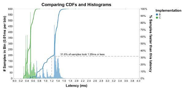
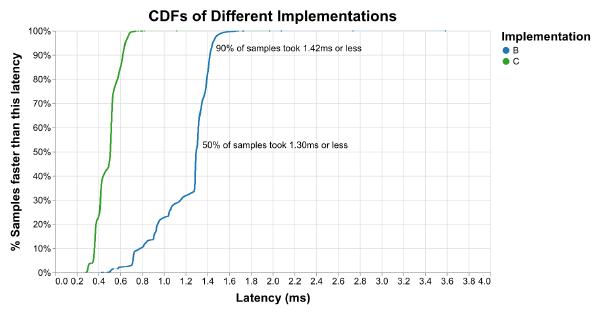
This is commonly written as pY for any value of Y. For example, the median is p50, the 50th percentile. If the p90 is 1.42 milliseconds, that means 90% of measurements were faster (and 10% slower) than 1.42 milliseconds.
I personally prefer to use the CCDF instead, which flips the y axis upside down. “I only need to make this faster in 20% of cases” makes me feel better than “I’m 80% of the way there.” It’s up to you. Just make sure to label your axes so everyone knows what kind of graph it is.
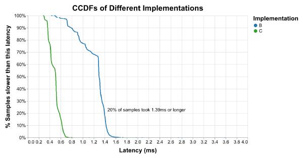
Context always matters when interpreting data, and percentiles are no different. The CCDF above shows that about 1% of C runs are slower (99% are faster) than 0.7ms. How often does this p99 happen? Well, we know that animationStep runs 30 times a second, or 1800 times a minute (30/second * 60 seconds/minute = 1800/minute). 1% of 1800 is 18, so this happens around 18 times per minute. If someone views the display case for 3 minutes, we can expect them to encounter this latency or worse about 54 times (18 * 3 = 54).
For this project, neither the people viewing the display case, nor the company displaying it, nor the artists I worked with cared how long animationStep takes. They would have cared if the display case appeared unresponsive or jittery (which it was before my speed improvements), so it was important for me to make sure that the overall latency of the system was always low enough to prevent that. Plotting the latency of animationStep and making it faster was a means to that end rather than the end itself. Doing so also had knock-on benefits. It allowed us to showcase additional reactive animations, reduced the power consumption of the computer, and produced less waste heat.
Putting it All Together
To make faster systems, start by Understanding the Problem. Identify the system inputs and outputs, and think about the hard constraints imposed by physics and the soft constraints imposed by your choices.
Then, Only Do Useful Work. Instead of complicated approaches, prefer simple solutions that are easy to understand, change, and optimize. Don’t skip over understanding by “optimizing” part of the system that didn’t need to exist in the first place. This step is not optional; it is where the biggest improvements come from.
Finally, Measure. When you make changes to your system, determine how the new system compares to the old one and how close it is to the theoretical top speed. Understand whether you care about latency, throughput, or both. Use profiling tools to identify the slow parts of the system and plot all the data to understand whether you’re actually making improvements. CDFs and CCDFs are great tools for this. Use the problem context to understand if the system is fast enough. Events that sound rare when summarized with percentiles might happen frequently in practice.
It seems self-evident that making faster systems is about taking slow systems and speeding them up, but it doesn’t have to be. It can also involve making a system that is faster than a slow system would have been. This might sound like a pedantic distinction, but I think the change in framing is important: it shifts the activity from cleaning up a mess after the fact to making better decisions.
In 1974, Knuth wrote “…premature optimization is the root of all evil.” Computing has changed since 1974, and many people don’t understand what he meant by “premature”. Maybe it’s time for a new phrase:
Ignoring reality is the root of all evil.
– Julian Ceipek, 2023
Go forth, and make faster systems!
Thanks to Casey Muratori, Mike Acton, and Gil Tene for teaching me new ways of thinking about software performance. Thanks to Cypress Frankenfeld, Lishan AZ, Clemens Ceipek, Elissa Ye, and Brendan Ritter for feedback on this essay.